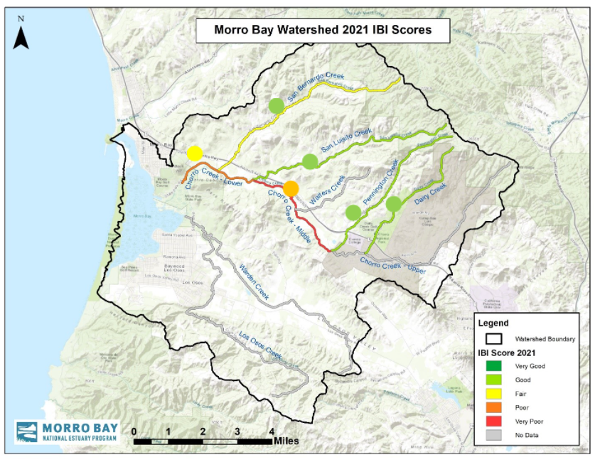
Each dot on the map represents historic data from 1995 to 2020, while the color of the creek represents the 2021 score. This year’s scores tended to be lower than their historic average. For example, San Bernardo historically scores as Good (represented by the green dot) but the 2021 score fell into the Fair category. These lower-than-average scores are thought to be due at least in part to below average rainfall this past winter.