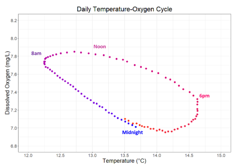
This graph displays the relationship between water temperature and dissolved oxygen levels over the course of a day. Each point represents one measurement, with the color scheme moving from blue (earlier in the day) to red (later), so that one day is represented by moving clockwise around the circle of points. This figure uses data taken on March 23, 2022 when we deployed the EXO3 at Pennington Creek.